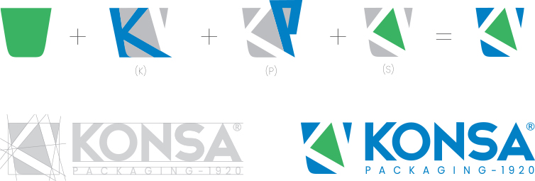
We have reflected the distribution (blue) and common values (green) around the world to represent the innovative, sustainable (S) structure that protects and extends product life cycles. While using geometric forms, we used the letters "K" of KONSA and "P" of PACKAGING and adapted them to this layout. Based on the compilation of KONSA products, we stylized the packages and determined the boundaries of the logo.